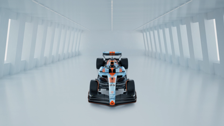
One of four Gulf x Williams Racing liveries is coming later this season, and our fans get to choose which one that will be.
Gulf has a rich history of iconic livery design in motorsport, and we at Williams Racing can't wait to be part of that story in Singapore, Japan and Qatar, where the winning livery will race.
Voting for Round 1 is now open between the Bolder than Bold and Contemporary designs until 12pm BST on 4 June to see which will make it to the grand final.
We recently caught up with Ed Scott, Head of Creative at Williams Racing, who talked us through the compelling challenge of creating the designs and dived deeper into the story behind Bolder than Bold.
"There was a brief that was set for each livery," explains Ed. "The names have varied and changed throughout the process. But, essentially, we've got four liveries: Heritage, Visionary, Contemporary and Bolder than Bold."
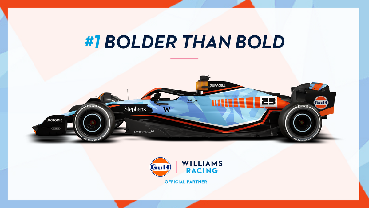
"Bolder than Bold was an excuse to just break the mould and do something a little bit more quirky.
"It is what it says on the tin. It is very bold. It used the Gulf branding in a way that's not typical.
"The brief was wide open. We could do what we wanted with it, but it still needed to look very Gulf.
"We had to do something really bold and so we had a lot of fun with this design. We wanted to do something that was exciting."
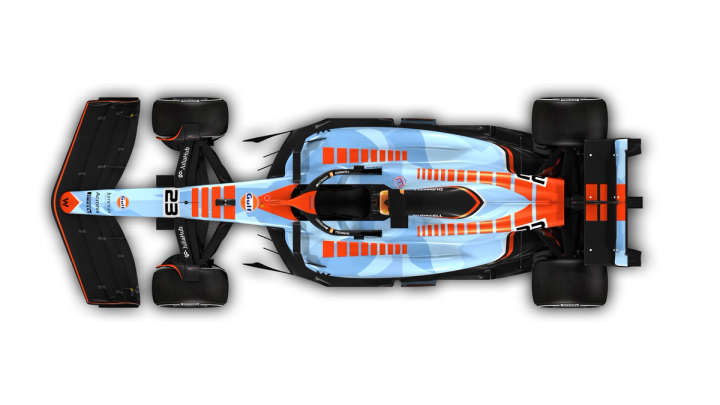
A bird's-eye view of the Bolder than Bold livery
Although featuring the same colours and core ideas, each of the four liveries has its own story.
Ed continues, explaining how Bolder than Bold and Contemporary diverged in their evolution by looking to the past.
"I didn't want to clash with the Contemporary one, but we wanted something that was contemporary Gulf.
"The way that we tackled that was by taking inspiration from past concept liveries gone by.
"Breaking up the Gulf stripe into a Chevron and then incorporating that into a camo pattern.
"Then finishing it off with nice, solid orange Gulf-coloured lines and angles going across the car."
Will you be voting for Bolder than Bold?
The orange-on-blue is unmissable in the Bolder than Bold design, but on closer inspection of that blue base is the camo effect.
Asymmetrical shapes with sharp angles subtly cover the entirety of the FW45 in a way that elevates the strong orange accents above.
The camo feature is Ed's favourite part of the Bolder than Bold design:
"I think it's just cool! Camo on F1 cars does just look mega!"
"But we have to be careful how we use it because camouflage hides stuff, and we don't want to hide too many sponsors.
"So this is a good chance to actually build it in a way that complemented the car without affecting too much of the real estate."
"I like how it all flows, and as a livery that then crosses over into other content, so I think it's really cool and different.
"It's quite simplistic as well as not if that makes sense? Obviously, it's not simplistic because of the amount of stuff going on in there.
"But it's executed in a way that has a clean look and feel. I'm a big fan of it."
Ed is a fan, but are you? Be sure to cast your vote in Round 1 before 12pm BST on 4 June if you want to see Bolder than Bold reach the grand final.
Bolder than Bold or Contemporary? Vote now
Final Round
Voting has ended
Related Tags:
Powered By
© the Williams Group, under licence to Williams IP Holdings LLC
Williams Grand Prix Engineering Limited is a company registered in England and Wales under company number 1297497.
Its registered office is at Grove, Wantage, Oxfordshire, OX12 0DQ
Powered By


