One question is dominating the water cooler chatter at Grove this week: Bolder than Bold or Contemporary?
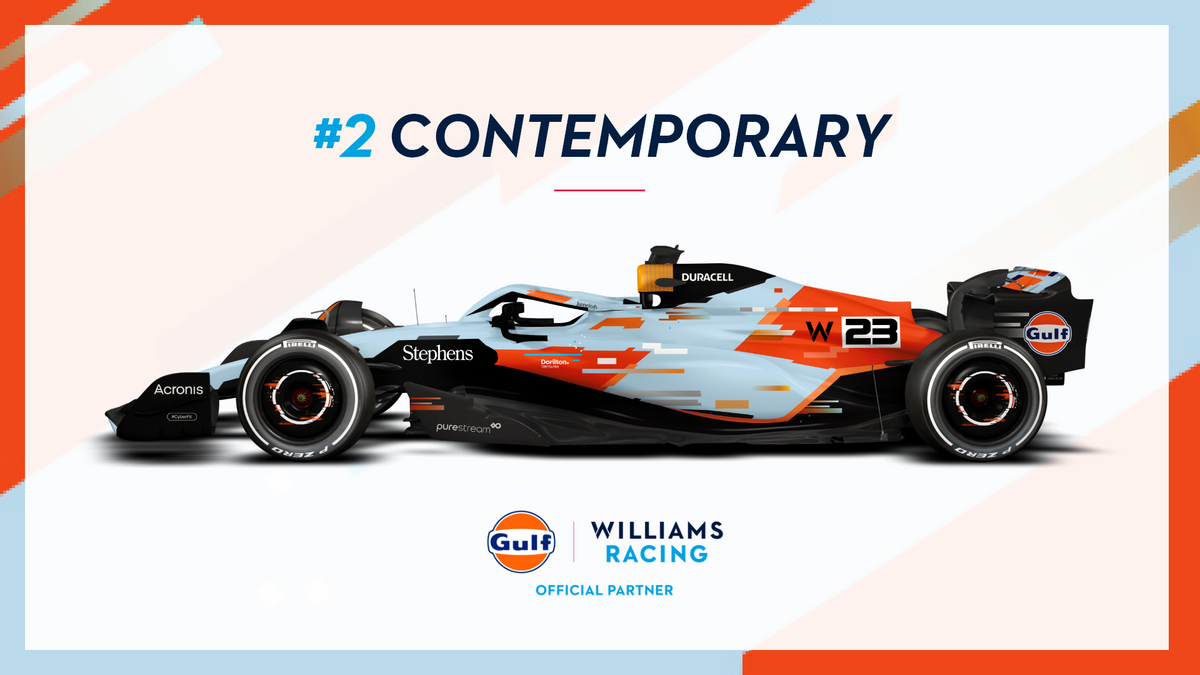
They're the names of the first two of four Gulf x Williams Racing liveries that could adorn the FW45 later this season.
When we arrive in Singapore, Japan and Qatar, our fans will have decided how we look, voting for one of four unique designs for Alex Albon and Logan Sargeant to race in.
You can vote in Round 1 until 12pm BST this Sunday 4 June, as we pit Bolder than Bold against Contemporary to see which livery will make it to the grand final.
We sat down with the Head of Creative at Williams Racing, Ed Scott, who gave us his insights into the Contemporary livery's origins.
"The brief was to do something around Esports and the digital space," Ed remembers. "The idea was to have pixels breaking up and flying across the bodywork.
"So they spanned from the front wing all the way across the car and chucked them out the back. It's meant to look like a bit of a digital glitch.
"It does give a really cool contemporary look and feel. You could call that contemporary digital.
"The glitches and the pixels that are shooting across it - they're the key features across the whole design. It really pops and looks really strong.
"I guess you could say we're racing in this metaverse or whatever you want to call it."
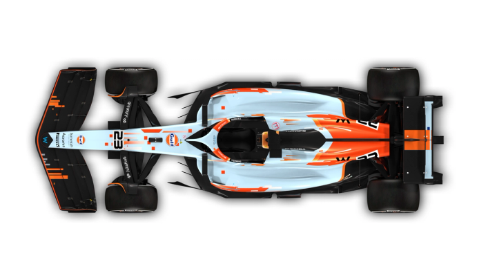
A bird's-eye view of the Contemporary livery
Digital esports was the brief then, but does Ed enjoy the creation at the other end? You bet he does.
"The Contemporary design is one of my favourite ones, purely because I've never seen a livery that looks like that. I just haven't!
"I think it looks so fresh having those pixels shooting across it.
"It still retains the Gulf brand, but in a really contemporary way that I don't think is obvious — the world would probably not necessarily think of Gulf instantly.
"I think if you saw Contemporary rock up on any car livery, whether it’s DTM, F1, F2, you'd go, 'wow what's that?'
"Then when you saw the Gulf logo on that and the way it flows, you can't argue that it's not Gulf.
“You'd go, 'oh yeah, of course it is!' But at the same time, it's really cool and different.
"So, in terms of thinking outside the box, I think Contemporary really ticks it. We're massive fans of it."
Will you be voting for Contemporary?
There certainly is a striking look to Contemporary — it's not like anything you'd expect to see on a Formula 1 car, and that's something which, as Ed explains, made the design process a challenge.
"I think Contemporary was actually probably the hardest to livery to do.
"It was all 'how do we do this' and put glitches in it and pixels and stuff? Essentially, you're making quite a messy livery.
"Taking something that's quite messy and making it hark back to the clean, slick design of what a Gulf livery is? It was probably the hardest one to do.
"We played around with it a lot to try and dial it in, to make sure that it was working right, which is another reason I'm such a fan of it — I think we've achieved that.
"It's really quite a crazy design, but it still retains that Gulf feel."
If you like what Ed and his team cooked up with the Contemporary design, and want to see it reach the grand final, you can vote for it in Round 1 before 12pm BST on 4 June.
Bolder than Bold or Contemporary? Vote now
Final Round
Voting has ended
Related Tags:
Powered By
© the Williams Group, under licence to Williams IP Holdings LLC
Williams Grand Prix Engineering Limited is a company registered in England and Wales under company number 1297497.
Its registered office is at Grove, Wantage, Oxfordshire, OX12 0DQ
Powered By


